Cascading Style Sheets (CSS)
Cascading Style Sheet (CSS) files contain rules for how to display and lay out the HTML content when it is rendered by a web browser.
Why is CSS necessary?
CSS separates content contained in the HTML file from how the content should be displayed. That separation between content and how to display it enables devices to render the content differently based on factors such as screen size.
For example, a mobile device does not have as much space to display a navigation bar on the side of a page so it is often pushed down below the main content. The Bootstrap Blog example shows that navigation bar relocation scenario when you resize the browser width.
How is CSS retrieved from a web server?
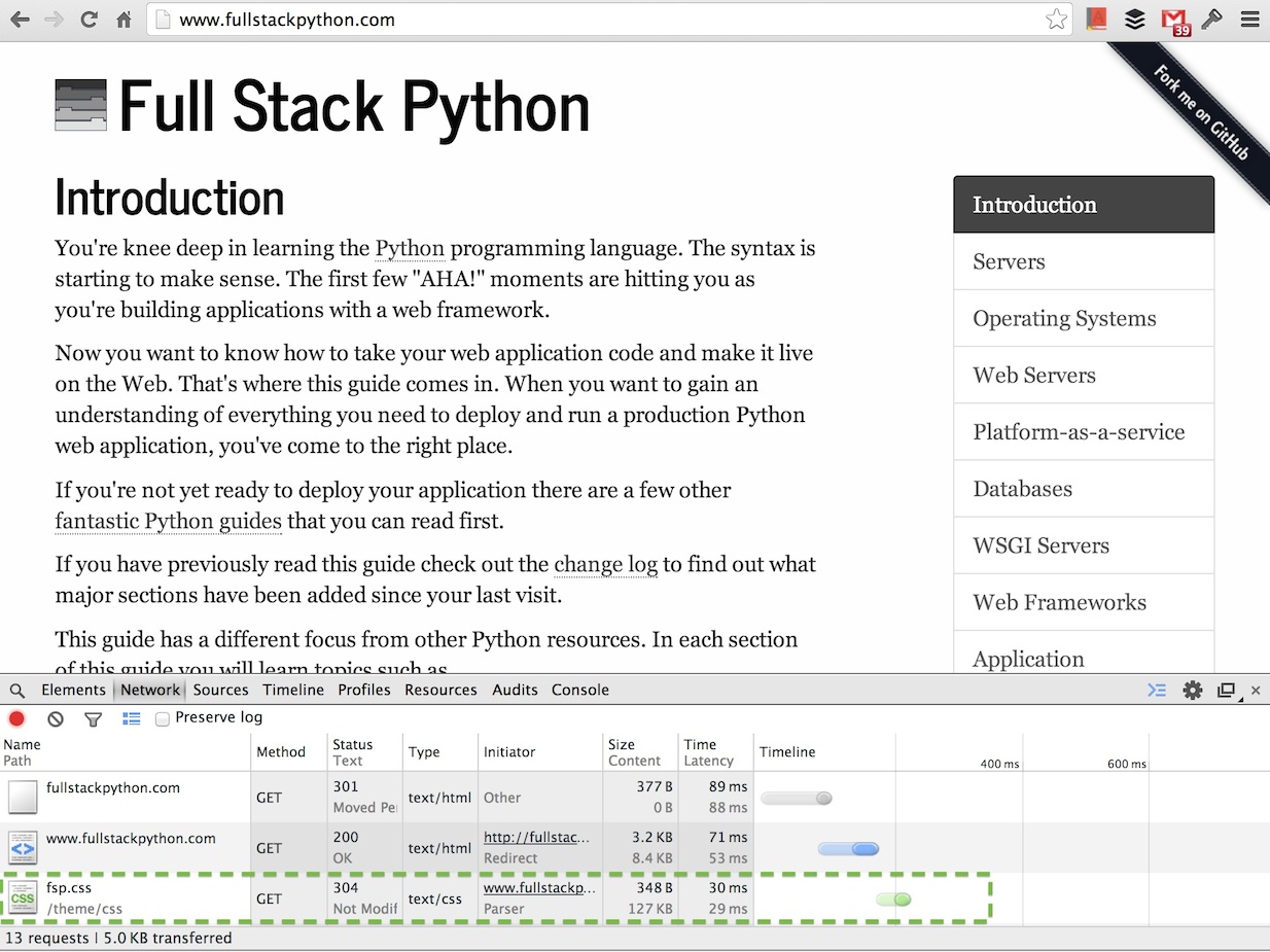
The HTML file sent by the web server contains a reference to the CSS file(s) needed to render the content. The web browser requests the CSS file after the HTML file as shown below in a screenshot captured of the Chrome Web Developer Tools network traffic.

That request for the fsp.css file is made because the HTML file for Full
Stack Python contains a reference to theme/css/fsp.css which is shown
in the view source screenshot below.

Responsive design
Responsive design is an approach for creating CSS that lays out content differently based on screen attributes. The responsiveness is accomplished by implementing media queries in the CSS.
CSS preprocessors
A CSS preprocessor compiles a processed language into plain CSS code. CSS preprocessing languages add syntax such as variables, mixins and functions to reduce code duplication. The additional syntax also makes it possible for designers to use these basic programming constructs to write maintainable front end code.
-
Sass is currently the favored preprocessor in the design community. Sass is considered the most powerful CSS preprocessor in terms of advanced language features.
-
LESS is right up there with Sass and has an ace up its sleeve in that the Bootstrap Framework is written in LESS which brings up its popularity.
-
Stylus is often cited as the third most popular CSS preprocessing language.
CSS preprocessor resources
-
The Advanced Guide to HTML and CSS book has a well-written chapter on preprocessors.
-
Sass vs LESS provides a short answer on which framework to use then a longer more detailed response for those interested in understanding the details.
-
How to choose the right CSS preprocessor has a comparison of Sass, LESS and Stylus.
-
Musings on CSS preprocessors contains helpful advice ranging from how to work with preprocessors in a team environment to what apps you can use to aid your workflow.
CSS frameworks
CSS frameworks provide structure and a boilerplate base for building a web application's design.
Design resources
-
The Bootstrapping Design book is one of the clearest and concise resources for learning design that I've ever read. Highly recommended especially if you feel you have no design skills but need to learn them.
-
Kuler is a complementary color picker by Adobe that helps choose colors for your designs.
CSS resources
-
Mozilla Developer Network's CSS page contains an extensive set of resources, tutorials and demos for learning CSS.
-
CSS Positioning 101 is a detailed guide for learning how to do element positioning correctly with CSS.
-
Learn CSS layout is a simple guide that breaks CSS layout topics into chapters so you can learn each part one at a time.
-
Google's Web Fundamentals class shows how to create responsive designs and performant websites.
-
Tailoring CSS for performance is an interesting read since many developers do not consider the implications of CSS complexity in browser rendering time.
CSS learning checklist
Create a simple HTML file with basic elements in it. Use the
python -m SimpleHTTPServer command to serve it up. Create a
<style></style> element within the <head> section in the HTML page.
Start playing with CSS within that style element to change the look and feel
of the page.
Check out front end frameworks such as Bootstrap and Foundation and integrate one of those into the HTML page.
Work through the framework's grid system, styling options and customization so you get comfortable with how to use the framework.
Apply the framework to your web application and tweak the design until you have something that looks much better than generic HTML.
Once your app is styled what do you need to learn next?
Cascading Style Sheets
Need more detailed tutorials and walkthroughs than what is presented here? Sign up for an email alert when that content is created.
Matt Makai 先生在社区的协助下设计并编写了这个站点。如果你有Github账号,可以 follow他哦。想跟近这本书的最新状态去Github Star 这个项目吧!

